Writing Task 1, Essay No. 3
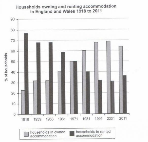
The chart below shows the percentage of households in owned and rented accommodation in England and Wales between 1918 and 2011.Summarize the information by selecting and reporting the main features, and make comparisons where relevant.

The bar chart provides information on the share of rented or owned houses in two countries of the United Kingdom, namely Wales and England from 1918 to 2011, a period spreading almost a hundred years.
Overall, it can be gleaned that rented households started off as the most opted method of dwelling, while ownership of houses were least favoured. However, the trend showed substantial difference towards the new millennium when they became inversely proportional, with renting in being least preferred and owning a house saw its peak.
To begin, in 1918, majority of families in England and Wales preferred to rent in their homes with almost four-fifth of the total population leasing. However, this trend continued to plummet decade after decade, seeing its lowest number in 2001 when only a little over 30% rented in. Although, a decade after, a minimal increase of less than 10% was seen.
On the contrary, household ownership in half of UK started off as least wanted than renting back in 1918 with only a meager 23% of owned houses. Nevertheless, the number of people wanting to own their accommodation continued to climb up, with its highest point during the beginning of 21st century when it elevated to almost 70% of the total number.
Despite the evident rise of household ownership and the considerable decrease of renters throughout the 90-year period, it can be gathered that in 1971 house owners and leasers were fairly equal in numbers, both of which having 50% share.
Comments
Post a Comment